

Bonus: Pointers for the course project#
This section provides practical guidance for scaling up from tutorial exercises to the course project. It covers the relevant information about the case, how to structure scenario studies, extract data programmatically, and manage multiple model runs efficiently.
Think of this as a toolbox, not a rulebook. Adapt freely to your own workflow and make it your own. Remember: the model is a means to an end, your analysis is what matters.
What you’ll learn#
Section |
Why it matters |
What you’ll learn |
|---|---|---|
Understand the real-world context |
Background materials and reports for the Drenthe/Emmen region |
|
Structure your analysis |
Four-step approach from demand modelling to scenario comparison |
|
Use realistic assumptions |
Where to find curated cost and efficiency parameters |
|
Automate scenario creation |
Using pyetm to set sliders and extract hourly curves |
|
Scale from 1 to many |
Define scenarios in YAML, validate with Pydantic, run systematically |
|
Explore results |
Create Plotly visualizations for capacity, cost, and dispatch |
|
Work effectively |
Version control, documentation, validation strategies |
|
Avoid mistakes |
Unit mismatches, temporal resolution, solver issues |
|
Speed up optimization |
HiGHS vs Gurobi, academic licenses |
|
Go deeper |
Links to documentation and advanced resources |
Project case study: ORTESE#
Provincie Drenthe - ORTESE project (course project focus)
Suggested workflow#
Recommended approach
Demand modelling in ETM
Create distinct narratives (all-electric, collective heating/hydrogen, EVs, industry electrification, etc.)Design optimization in PyPSA
Find optimal system configurations for each demand scenarioSensitivity analysis
Run multiple (demand)scenarios with different boundary conditions (demand narrative, spatial constraints, technology limits, cost assumptions)Data analysis in Python
Compare scenarios and create visualizations
And, of course, iterate where needed. Form hypotheses, analyse and validate, form insights and adopt new learnings.
Technology data#
The PyPSA community maintains a curated technology cost database:
This includes investment costs, efficiencies, lifetimes, and other parameters for generation, storage, and conversion technologies.
Programmatic ETM access with pyetm#
The pyetm package allows you to interact with the Energy Transition Model via Python. This is useful for programmatically creating scenarios, adjusting sliders, and extracting hourly demand curves.
For full documentation, see the pyetm documentation.
Quick example#
from pyetm import Scenario

# Create a new scenario for a region
scenario = Scenario.create(region=205, end_year=2050)

# Update ETM sliders
scenario.update_inputs({
    "buildings_solar_pv_solar_radiation": 0.55,
    "transport_car_using_electricity_share": 0.43,
})

# Get hourly electricity curves
curves = scenario.hourly_electricity_curves
Extracting demand curves for PyPSA#
For your project, you’ll want to extract specific demand curves from the ETM to use as input for PyPSA. As an example let’s extract some relevant curves from the ETM for the built environment. For a complete overview of extractable curves, explore the data export section on your scenarios (under Results & Data > Data Export).
import logging
logging.getLogger("pyetm").setLevel(logging.WARNING)

from pyetm import Client
import matplotlib.pyplot as plt
import seaborn as sns

# Set clean white theme for all plots
sns.set_theme("notebook", style="white")
plt.rc("axes.spines", top=False, right=False)

# Connect to an existing scenario (copy of II3050 Regional scenario)
# Note: scenario IDs expire - create your own via energytransitionmodel.com
SCENARIO_ID = 1018149
client = Client(scenario_id=SCENARIO_ID)

# Get hourly electricity curves
electricity_curves = client.hourly_electricity_curves

# Plot a winter week - shows heating demand peaks and electricity patterns
fig, axes = plt.subplots(2, 1, figsize=(12, 6), sharex=True)

week_slice = slice(0, 168)  # First week of January

# Residential electricity: heat pumps and EV charging
hp_col = [c for c in electricity_curves.columns if 'households' in c and 'heatpump' in c and 'input' in c]
ev_col = [c for c in electricity_curves.columns if 'transport_car' in c and 'electricity' in c and 'input' in c]

hp_demand = electricity_curves[hp_col].sum(axis=1).iloc[week_slice] if hp_col else None
ev_demand = electricity_curves[ev_col].sum(axis=1).iloc[week_slice] if ev_col else None

if hp_demand is not None:
    axes[0].plot(hp_demand.values, color="steelblue", label="Heat pumps")
if ev_demand is not None:
    axes[0].plot(ev_demand.values, color="seagreen", label="EV charging")
axes[0].set_ylabel("Electricity (MW)")
axes[0].set_title("Residential electricity demand - January week")
axes[0].legend()

# Residential and utility roof top solar generation
households_solar = [c for c in electricity_curves.columns if 'households' in c and 'solar' in c and 'output' in c]
solar_generation = electricity_curves[households_solar].sum(axis=1).iloc[week_slice] if households_solar else None

if solar_generation is not None:
    axes[1].plot(solar_generation.values, color="firebrick")
axes[1].set_ylabel("Electricity (MW)")
axes[1].set_title("Household solar generation - January week")
axes[1].set_xlabel("Hour of week")

axes[1].legend()

plt.tight_layout()
/var/folders/_d/_y52v1vx0jl8d405bt93gbq40000gn/T/ipykernel_86029/446113056.py:50: UserWarning:

No artists with labels found to put in legend.  Note that artists whose label start with an underscore are ignored when legend() is called with no argument.
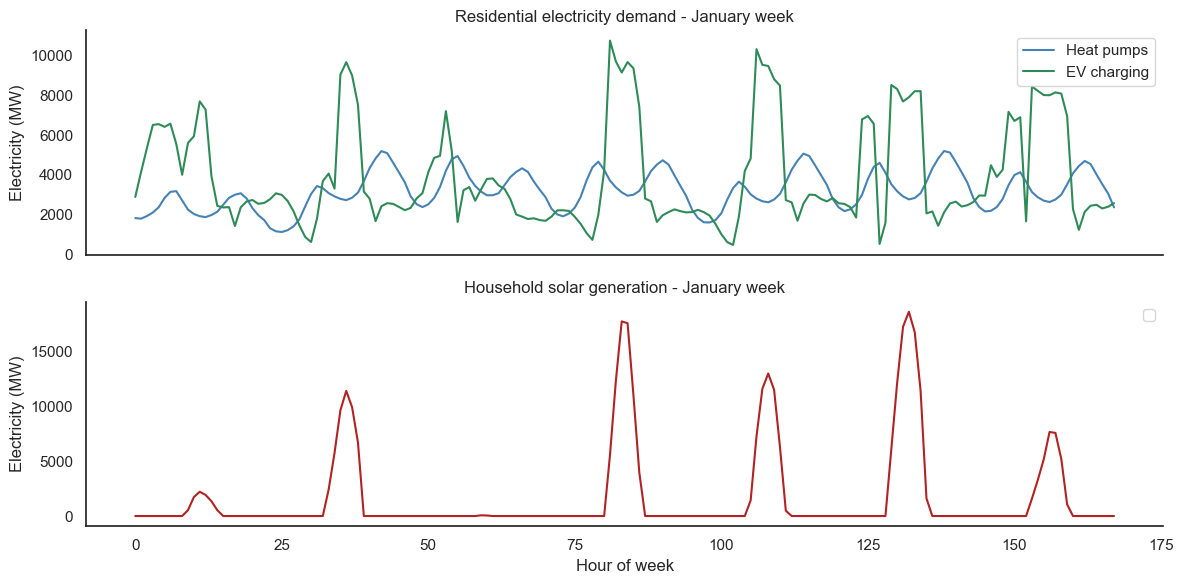
The winter week clearly shows patterns:
Heatpump and EV charging
Daily heat deman patterns with morning/evening peaks, lower demand at night and weekends. EV charing mostly during the day, probably because of smart charging responding to solar production.Residential solar
Strong daily pattern, including cloudy or low sun days.
Understanding these patterns is crucial for understanding the trade-off dynamics in your PyPSA model.
Configuring and running multiple scenarios#
For project work, you’ll want to run many scenarios systematically. This section demonstrates one possible approach using configuration files and Pydantic for validation. It also delivers some quality of life out of the box, such as loading various formats - like YAML used in this example.
Adapt to your needs
The patterns shown here are suggestions, not requirements. Feel free to:
Simplify or extend the data models
Use plain dictionaries instead of Pydantic
Structure your configuration files differently
Skip YAML entirely and define scenarios directly in Python (anti-pattern but pragmatic)
The goal is to help you think about how to organize scenario runs systematically. Find what works for your workflow.
Scenario configuration with YAML and Pydantic#
Pydantic is a Python library for data validation. It lets you define structured configuration objects that catch errors early (wrong types, missing fields) rather than failing deep in your optimization code.
Below we define models for ETM and PyPSA configurations. These are minimal examples — add or remove fields as your project needs them:
from pydantic import BaseModel, Field
from typing import Optional
from pathlib import Path


class ETMInput(BaseModel):
    """A single ETM (slider) input"""
    key: str
    value: int | float | bool


class ETMConfig(BaseModel):
    """Configuration for ETM scenario"""
    scenario_id: Optional[int] = None
    inputs: list[ETMInput] = Field(default_factory=list)


class PyPSAConfig(BaseModel):
    """Configuration for PyPSA optimization"""
    max_solar_gw: float = 100
    max_wind_onshore_gw: float = 50
    battery_cost_factor: float = 1.0
    interconnection_gw: float = 0  # Import capacity from neighbors
    solver: str = "highs"


class Scenario(BaseModel):
    """Complete scenario definition"""
    name: str
    description: str = ""
    etm: ETMConfig
    pypsa: PyPSAConfig

    @property
    def output_dir(self) -> Path:
        return Path("outputs") / self.name


class ScenarioSet(BaseModel):
    """Collection of scenarios to run"""
    scenarios: list[Scenario]

    # These functions below allow iteration and indexing directly on ScenarioSet
    # (e.g. for scenario in scenario_set)
    def __iter__(self):
        yield from self.scenarios

    def __getitem__(self, index):
        return self.scenarios[index]

    def __len__(self):
        return len(self.scenarios)


print("Pydantic models defined successfully!")
Pydantic models defined successfully!
Example YAML configuration#
Here’s how you would define scenarios in a scenarios.yaml file:
import yaml

# Example scenario configuration (normally loaded from file)
yaml_content = """
scenarios:
  - name: "baseline"
    description: "Current policy trajectory"
    etm:
      scenario_id: 14552
    pypsa:
      max_solar_gw: 250
      max_wind_onshore_gw: 90
      battery_cost_factor: 1.0
      interconnection_gw: 0

  - name: "with_interconnection"
    description: "10 GW import capacity from neighbors"
    etm:
      scenario_id: 14552
    pypsa:
      max_solar_gw: 250
      max_wind_onshore_gw: 90
      battery_cost_factor: 1.0
      interconnection_gw: 10

  - name: "constrained_space"
    description: "Limited land availability for renewables, policy support for batteries and interconnection"
    etm:
      scenario_id: 14552
    pypsa:
      max_solar_gw: 125
      max_wind_onshore_gw: 45
      battery_cost_factor: 0.8
      interconnection_gw: 15
"""

# Parse and validate
data = yaml.safe_load(yaml_content)
scenario_set = ScenarioSet(**data)

print(f"Loaded {len(scenario_set.scenarios)} scenarios:")
for s in scenario_set:
    print(f"  - {s.name}: {s.description}")
Loaded 3 scenarios:
  - baseline: Current policy trajectory
  - with_interconnection: 10 GW import capacity from neighbors
  - constrained_space: Limited land availability for renewables, policy support for batteries and interconnection
# Inspect one scenario in detail
scenario = scenario_set.scenarios[1]  # with_interconnection
print(f"Scenario: {scenario.name}")
print(f"Description: {scenario.description}")
print(f"Output directory: {scenario.output_dir}")
print(f"\nETM config:")
print(f"  Scenario ID: {scenario.etm.scenario_id}")
print(f"  Custom inputs: {scenario.etm.inputs}")
print(f"\nPyPSA config:")
print(f"  Max solar: {scenario.pypsa.max_solar_gw} GW")
print(f"  Max wind onshore: {scenario.pypsa.max_wind_onshore_gw} GW")
print(f"  Interconnection: {scenario.pypsa.interconnection_gw} GW")
Scenario: with_interconnection
Description: 10 GW import capacity from neighbors
Output directory: outputs/with_interconnection

ETM config:
  Scenario ID: 14552
  Custom inputs: []

PyPSA config:
  Max solar: 250.0 GW
  Max wind onshore: 90.0 GW
  Interconnection: 10.0 GW
Scenario runner functions#
Now let’s define functions that use these configurations to run scenarios. These are templates you can adapt for your project:
import pandas as pd
import pypsa
import logging

# Suppress solver output
logging.getLogger("pypsa").setLevel(logging.ERROR)
logging.getLogger("linopy").setLevel(logging.ERROR)

# Scale factor for capital costs (we're running 1 month, costs are annualized)
MONTHS_IN_SIMULATION = 1
CAPITAL_COST_SCALE = MONTHS_IN_SIMULATION / 12


def get_etm_demand(scenario: Scenario) -> pd.DataFrame:
    """Extract demand curves from ETM for a scenario."""
    etm_config = scenario.etm

    client = Client(scenario_id=etm_config.scenario_id)

    # Apply any custom inputs
    if etm_config.inputs:
        input_dict = {inp.key: inp.value for inp in etm_config.inputs}
        client.input_parameters = input_dict

    curves = client.hourly_electricity_curves
    return curves


def create_pypsa_network(
    demand: pd.DataFrame,
    config: PyPSAConfig,
    solar_profile: pd.Series,
    wind_profile: pd.Series,
    price_curve: pd.Series = None,
) -> pypsa.Network:
    """Create PyPSA network with scenario-specific parameters."""
    n = pypsa.Network()
    n.set_snapshots(demand.index)

    # Add bus
    n.add("Bus", "electricity")

    # Add load from ETM demand
    n.add("Load", "demand",
          bus="electricity",
          p_set=demand.values)

    # Add generators with scenario-specific limits
    # Capital costs scaled for simulation period (1 month of annual cost)
    n.add("Generator", "solar",
          bus="electricity",
          p_nom_extendable=True,
          p_nom_max=config.max_solar_gw * 1000,
          capital_cost=50000 * CAPITAL_COST_SCALE,
          marginal_cost=0,
          p_max_pu=solar_profile)

    n.add("Generator", "wind_onshore",
          bus="electricity",
          p_nom_extendable=True,
          p_nom_max=config.max_wind_onshore_gw * 1000,
          capital_cost=100000 * CAPITAL_COST_SCALE,
          marginal_cost=0,
          p_max_pu=wind_profile)

    # Add storage with cost factor
    base_battery_cost = 150000  # €/MW/year
    n.add("StorageUnit", "battery",
          bus="electricity",
          p_nom_extendable=True,
          capital_cost=base_battery_cost * config.battery_cost_factor * CAPITAL_COST_SCALE,
          max_hours=4,
          efficiency_store=0.9,
          efficiency_dispatch=0.9,
          cyclic_state_of_charge=True)

    # Add interconnection (import only) if configured
    if config.interconnection_gw > 0 and price_curve is not None:
        n.add("Generator", "interconnection",
              bus="electricity",
              p_nom=config.interconnection_gw * 1000,  # Fixed capacity in MW
              p_nom_extendable=False,
              marginal_cost=price_curve.values)  # Time-varying price

    # Add loss of load generator to ensure feasibility
    # Value of Lost Load (VOLL) at €8000/MWh
    n.add("Generator", "loss_of_load",
          bus="electricity",
          p_nom_extendable=True,
          capital_cost=0,
          marginal_cost=8000)

    return n


def run_scenario(
    scenario: Scenario,
    demand: pd.Series,
    solar: pd.Series,
    wind: pd.Series,
    price_curve: pd.Series = None
) -> dict:
    """Run a single scenario end-to-end."""
    print(f"Running scenario: {scenario.name}...", end=" ", flush=True)

    # Create output directory
    output_dir = scenario.output_dir
    output_dir.mkdir(parents=True, exist_ok=True)

    # Create and solve PyPSA network
    network = create_pypsa_network(demand, scenario.pypsa, solar, wind, price_curve)
    network.optimize(
        solver_name=scenario.pypsa.solver,
        solver_options={"output_flag": False}
    )

    # Extract key results
    results = {
        "name": scenario.name,
        "total_cost": network.objective,
        "solar_capacity_gw": network.generators.loc["solar", "p_nom_opt"] / 1000,
        "wind_capacity_gw": network.generators.loc["wind_onshore", "p_nom_opt"] / 1000,
        "battery_capacity_gw": network.storage_units.loc["battery", "p_nom_opt"] / 1000,
        "loss_of_load_gwh": network.generators_t.p["loss_of_load"].sum() / 1000,
    }

    # Add interconnection usage if present
    if "interconnection" in network.generators.index:
        results["interconnection_gwh"] = network.generators_t.p["interconnection"].sum() / 1000
    else:
        results["interconnection_gwh"] = 0.0

    # Save scenario config for reproducibility
    with open(output_dir / "config.yaml", "w") as f:
        yaml.dump(scenario.model_dump(), f)

    # Save demand data used in this scenario
    demand.to_csv(output_dir / "etm_demand.csv")

    # Save complete network with results
    network.export_to_netcdf(output_dir / "network.nc")

    print(f"Done! Cost: €{results['total_cost']/1e6:.1f}M")
    return results, network


print("Runner functions defined!")
Runner functions defined!
Running the scenarios#
Let’s run our example scenarios using the tutorial data:
# Load the tutorial timeseries data
ts = pd.read_csv("data/timeseries.csv", index_col=0, parse_dates=True)

# Use June (month 6) - better solar, more representative mix
# For real projects, you'd use the full year or representative periods
june_start = 24 * (31 + 28 + 31 + 30 + 31)  # Days before June
ts = ts.iloc[june_start:june_start + 24*30]  # 30 days of June

print(f"Using {len(ts)} hours ({len(ts)//24} days) for quick demo - June")
print(f"Columns: {ts.columns.tolist()}")
ts.head()
Using 720 hours (30 days) for quick demo - June
Columns: ['load', 'solar', 'wind']
| load | solar | wind | |
|---|---|---|---|
| time | |||
| 2019-06-01 00:00:00 | 34504.2835 | 0.000 | 0.075 |
| 2019-06-01 01:00:00 | 31998.4427 | 0.000 | 0.105 |
| 2019-06-01 02:00:00 | 30983.6631 | 0.000 | 0.137 |
| 2019-06-01 03:00:00 | 28730.1010 | 0.000 | 0.167 |
| 2019-06-01 04:00:00 | 31240.5374 | 0.035 | 0.171 |
# Get ETM electricity price curve for interconnection scenarios
# This represents the wholesale price of importing power from neighbors
price_curves = client.hourly_electricity_price_curve
price_curve = price_curves.iloc[june_start:june_start + 24*30]  # Same slice as demand

# Make sure index matches the timeseries
price_curve = price_curve.reset_index(drop=True)
price_curve.index = ts.index

print(f"Price curve range: €{price_curve.values.min():.0f} - €{price_curve.values.max():.0f}/MWh")

# Run all scenarios
all_results = []
networks = {}

for scenario in scenario_set.scenarios:
    result, network = run_scenario(
        scenario,
        demand=ts["load"],
        solar=ts["solar"],
        wind=ts["wind"],
        price_curve=price_curve if scenario.pypsa.interconnection_gw > 0 else None
    )
    all_results.append(result)
    networks[scenario.name] = network

# Combine results
results_df = pd.DataFrame(all_results)

# Save scenario comparison summary
Path("outputs").mkdir(exist_ok=True)
results_df.to_csv("outputs/scenario_comparison.csv", index=False)

print("\n" + "="*50)
print("Scenario comparison:")
print("="*50)
results_df
Price curve range: €0 - €119/MWh
Running scenario: baseline... Done! Cost: €3981.0M
Running scenario: with_interconnection... Done! Cost: €3236.2M
Running scenario: constrained_space... Done! Cost: €5952.8M

==================================================
Scenario comparison:
==================================================
| name | total_cost | solar_capacity_gw | wind_capacity_gw | battery_capacity_gw | loss_of_load_gwh | interconnection_gwh | |
|---|---|---|---|---|---|---|---|
| 0 | baseline | 3.981034e+09 | 250.0 | 62.727735 | 193.330934 | 0.0 | 0.000000 |
| 1 | with_interconnection | 3.236160e+09 | 250.0 | 23.221064 | 159.173208 | 0.0 | 1623.897669 |
| 2 | constrained_space | 5.952843e+09 | 125.0 | 45.000000 | 480.064779 | 0.0 | 9768.380444 |
Output structure#
Running the scenarios creates an organized output structure:
outputs/
├── scenario_comparison.csv      # Summary of all scenarios
├── baseline/
│   ├── config.yaml              # Scenario configuration (for reproducibility)
│   ├── etm_demand.csv           # Demand curves used in the scenario
│   └── network.nc               # Full PyPSA network with results
├── with_interconnection/
│   └── ...
└── constrained_space/
    └── ...
Comparing scenarios with interactive plots#
Static plots work for reports, but interactive visualization helps you explore results and identify patterns. This section shows how to create interactive comparisons using Plotly.
The functions below demonstrate common visualization patterns. Adapt them to show whatever metrics matter for your analysis.
Capacity comparison#
A grouped bar chart is a straightforward way to compare installed capacities across scenarios. The function below:
Reshapes the results DataFrame using
melt()to convert from wide format (one column per technology) to long format (one row per scenario-technology pair)Creates a grouped bar chart with Plotly Express, grouping bars by scenario
Returns a figure object that can be displayed or saved
This pattern — reshape data, create figure, return figure — works well for building a library of reusable plotting functions.
import plotly.express as px
import plotly.graph_objects as go
import plotly.io as pio
from IPython.display import HTML

# Set clean white theme for all Plotly plots
pio.templates.default = "simple_white"


def show_plotly(fig):
    """Helper to display Plotly figures in Jupyter Book builds."""
    return HTML(fig.to_html(full_html=False, include_plotlyjs='cdn'))


def plot_capacity_comparison(results: pd.DataFrame) -> go.Figure:
    """Create interactive bar chart comparing capacities."""
    # Reshape for plotting
    capacity_cols = [c for c in results.columns if c.endswith("_gw")]
    df_plot = results.melt(
        id_vars=["name"],
        value_vars=capacity_cols,
        var_name="technology",
        value_name="capacity_gw"
    )
    df_plot["technology"] = df_plot["technology"].str.replace("_capacity_gw", "").str.replace("_", " ").str.title()

    fig = px.bar(
        df_plot,
        x="name",
        y="capacity_gw",
        color="technology",
        barmode="group",
        title="Installed Capacities by Scenario",
        labels={"capacity_gw": "Capacity (GW)", "name": "Scenario", "technology": "Technology"}
    )

    fig.update_layout(
        legend_title="Technology",
        hovermode="x unified"
    )

    fig.update_traces(
        hovertemplate="%{fullData.name}: %{y:.2f} GW<extra></extra>"
    )

    return fig


fig = plot_capacity_comparison(results_df)
show_plotly(fig)
Cost comparison#
Comparing absolute costs can be misleading when scenarios have very different scales. Normalizing to a baseline scenario makes relative differences clearer. The function below:
Calculates relative cost as a percentage of the baseline scenario
Adds a reference line at 100% to show the baseline
Displays values on bars using the
textparameter for easy reading
def plot_cost_comparison(results: pd.DataFrame) -> go.Figure:
    """Create cost comparison with baseline reference."""
    df = results.copy()
    baseline_cost = df.loc[df["name"] == "baseline", "total_cost"].iloc[0]
    df["relative_cost"] = df["total_cost"] / baseline_cost * 100

    fig = px.bar(
        df,
        x="name",
        y="relative_cost",
        title="System Cost Relative to Baseline",
        labels={"relative_cost": "Cost (% of baseline)", "name": "Scenario"},
        color="name",
        text=df["relative_cost"].apply(lambda x: f"{x:.0f}%")
    )

    # Add baseline reference line
    fig.add_hline(
        y=100,
        line_width=2,
        line_dash="dash",
        line_color="black",
        annotation_text="Baseline",
        annotation_position="top",
        layer="above"
    )

    fig.update_traces(textposition="outside")
    fig.update_layout(showlegend=False)

    return fig, df


fig, df = plot_cost_comparison(results_df)
fig.update_yaxes(range=[0, df["relative_cost"].max() * 1.1])
fig.update_traces(hovertemplate="%{y:.2f}%<extra></extra>")
show_plotly(fig)
Dispatch patterns#
Time-series dispatch plots reveal how different scenarios operate hour-by-hour. This is where you see storage cycling, curtailment patterns, and how supply meets demand. The function below:
Creates subplots — one row per scenario for easy visual comparison
Uses stacked areas to show supply (positive) and demand (negative) components
Extracts data from PyPSA network objects — generators, storage, and loads
Supports week selection to zoom into specific periods of interest
This type of plot is useful for understanding the operational dynamics behind the capacity and cost numbers.
from plotly.subplots import make_subplots


def plot_dispatch_comparison(
    networks: dict[str, pypsa.Network],
    week_start: int = 0,  # Week number (0-indexed)
) -> go.Figure:
    """Compare dispatch patterns across scenarios - supply positive, demand negative."""
    scenarios = list(networks.keys())

    fig = make_subplots(
        rows=len(scenarios), cols=1,
        shared_xaxes=True,
        subplot_titles=[s.replace("_", " ").title() for s in scenarios],
        vertical_spacing=0.08
    )

    colors = {
        "solar": "#F4C430",
        "wind_onshore": "#4B90B9",
        "interconnection": "#9B59B6",
        "loss_of_load": "#D62728",
        "battery_discharge": "#2ECC71",
        "battery_charge": "#1E8449",
        "load": "#708090",
    }

    for i, (scenario_name, n) in enumerate(networks.items(), 1):
        show_legend = (i == len(scenarios))
        # Get one week of data
        start_idx = week_start * 168
        end_idx = min(start_idx + 168, len(n.snapshots))
        hours = list(range(end_idx - start_idx))

        # SUPPLY (positive): generation + battery discharge
        for gen in n.generators.index:
            gen_p = n.generators_t.p[gen].iloc[start_idx:end_idx]
            if gen_p.sum() > 0:  # Only show if used
                fig.add_trace(
                    go.Scatter(
                        x=hours,
                        y=gen_p.values / 1000,  # Convert to GW
                        name=gen.replace("_", " ").title(),
                        stackgroup="supply",
                        line=dict(width=0),
                        fillcolor=colors.get(gen, "#9CAF88"),
                        showlegend=show_legend,
                    ),
                    row=i, col=1
                )

        # Battery discharge (positive supply)
        if "battery" in n.storage_units.index:
            battery_dispatch = n.storage_units_t.p_dispatch["battery"].iloc[start_idx:end_idx]
            if battery_dispatch.sum() > 0:
                fig.add_trace(
                    go.Scatter(
                        x=hours,
                        y=battery_dispatch.values / 1000,
                        name="Battery discharge",
                        stackgroup="supply",
                        line=dict(width=0),
                        fillcolor=colors["battery_discharge"],
                        showlegend=show_legend
                    ),
                    row=i, col=1
                )

        # DEMAND (negative): load + battery charging
        load = -n.loads_t.p_set["demand"].iloc[start_idx:end_idx]
        fig.add_trace(
            go.Scatter(
                x=hours,
                y=load.values / 1000,
                name="Load",
                stackgroup="demand",
                line=dict(width=0),
                fillcolor=colors["load"],
                showlegend=show_legend
            ),
            row=i, col=1
        )

        # Battery charging (negative demand)
        if "battery" in n.storage_units.index:
            battery_store = -n.storage_units_t.p_store["battery"].iloc[start_idx:end_idx]
            if abs(battery_store.sum()) > 0:
                fig.add_trace(
                    go.Scatter(
                        x=hours,
                        y=battery_store.values / 1000,
                        name="Battery charge",
                        stackgroup="demand",
                        line=dict(width=0),
                        fillcolor=colors["battery_charge"],
                        showlegend=show_legend
                    ),
                    row=i, col=1
                )

        # Zero line for reference
        fig.add_hline(y=0, line_color="black", line_width=1, row=i, col=1)

    fig.update_layout(
        height=300 * len(scenarios),
        title=f"Supply & demand balance (week {week_start + 1})",
        hovermode="x unified"
    )

    fig.update_yaxes(title_text="Power (GW)")
    fig.update_xaxes(title_text="Hour of week", row=len(scenarios), col=1)

    return fig


fig = plot_dispatch_comparison(networks, week_start=0)
# place legend in horizontal, col style below the title
fig.update_layout(legend=dict(yanchor="top", y=1.07, xanchor="left", x=-0.04, orientation="h"))
show_plotly(fig)
Best practices#
Tips for effective project work
Version control your configs
Keepscenarios.yamlin git so you can track what changed between runsDocument assumptions
Add descriptions to each scenario explaining the narrative and key assumptionsStart simple
Begin with 2-3 scenarios before scaling up to many variationsValidate incrementally
Check ETM outputs before feeding into PyPSA; check PyPSA setup before running optimizationUse meaningful names
high_electrification_low_windis better thanscenario_3Save everything
Store configs, intermediate data, and results for reproducibility
Common pitfalls#
Watch out for these issues
Unit mismatches
ETM often uses PJ/year, PyPSA uses MW/MWh - convert carefully!Temporal resolution
ETM hourly curves may need resampling to match your PyPSA snapshots and requires consideration of a fitting timestepMissing data
Not all ETM curves are available for all scenarios - check what you get backSolver issues
Complex problems may need solver tuning or simplification
Solver options#
The default solver in PyPSA is HiGHS, which is open-source and works well for most problems.
Gurobi academic license
For larger or more complex models, Gurobi is significantly faster. As a student, you can get a free license:
Academic license
Request a free academic license - valid while you’re a studentTake Gurobi With You
Academic users are eligible for the Take Gurobi With You program, allowing continued use after graduation
Further reading#
PyPSA-Eur - for inspiration on large-scale scenario management